Difference between revisions of "Explorer Navigation"
(→Hirachical View) |
(Set PropertyValue: Progress = 100) |
||
| (25 intermediate revisions by 2 users not shown) | |||
| Line 6: | Line 6: | ||
<span style="color:#00BFFF">'''STATUS: The design is completed. The implementation in progress.'''</span> | <span style="color:#00BFFF">'''STATUS: The design is completed. The implementation in progress.'''</span> | ||
| − | == The Design of Explorer Navigation | + | == The Design of Explorer Navigation == |
| − | Tasks are | + | Tasks with visual recognizable needed contribution are faster accomplished. Therefore all tasks of this wiki are hierarchically organized like our files in the most common operating systems. Everyone knows the windows explorer to browse folder and files. |
| + | |||
| + | === Hierarchical View === | ||
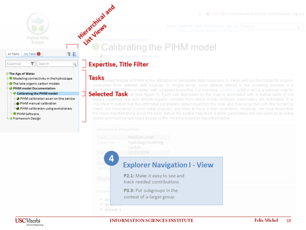
| + | The '''hierarchical view''' is related to the well-known file explorer pattern. The sidebar on the left represents all tasks hierarchical browsable and the task content is represented on the right side. The [[Progress Tracking | task progress]] is visualized by the pie chart icons in front of each browsable task item. Needed contributions can be found easily by a task drill down. All tasks are linked to the [[Task Representation| task representation]] page. | ||
| + | |||
| + | === Selected Task === | ||
| + | The currently '''selected task''' is highlighted with a light blue background. Related to the selected task all task details are represented on the right side. | ||
| − | |||
| − | |||
<div style="border:1px solid #eeeeee; width:610px">[[File:Mockup_4_Explorer_Navigation_I.png|600px]]</div> | <div style="border:1px solid #eeeeee; width:610px">[[File:Mockup_4_Explorer_Navigation_I.png|600px]]</div> | ||
| Line 16: | Line 20: | ||
<br/> | <br/> | ||
| − | === | + | === Expertise Filter and Text Search === |
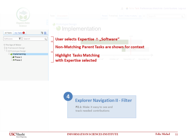
| − | Over time many tasks will be listed therefore a search- and filter function helps to find the | + | Over time many tasks will be listed therefore a search- and filter function helps to find the personal interesting and important tasks. Searching for certain task names are works easily by typing it into the '''search''' field. The '''filter''' functionality is powerful to search for certain fields of expertise. In both cases the results are shown within the hierarchical task context. All not matching tasks are not visible or grayed out. Parent tasks of matches are grayed to describe the context of the search and filter results. Results itself are represented in the normal layout style. The search and filter functionality can be used together. |
<div style="border:1px solid #eeeeee; width:610px">[[File:Mockup_4_Explorer_Navigation_II.png|600px]]</div> | <div style="border:1px solid #eeeeee; width:610px">[[File:Mockup_4_Explorer_Navigation_II.png|600px]]</div> | ||
| − | <div style="background-color: #eeeeee; width:610px; font-size:smaller; color:#999999; font-style:italic; padding-left:5px;">Explorer Navigation - | + | <div style="background-color: #eeeeee; width:610px; font-size:smaller; color:#999999; font-style:italic; padding-left:5px;">Explorer Navigation - Hierachical View with Applied Filter Mockup</div> |
| − | + | ||
==Comments and Feedback== | ==Comments and Feedback== | ||
| Line 31: | Line 34: | ||
<!-- Do NOT Edit below this Line --> | <!-- Do NOT Edit below this Line --> | ||
{{#set: | {{#set: | ||
| + | Depends on=Progress_Tracking| | ||
End date=15-July-2014| | End date=15-July-2014| | ||
Expertise=Collaboration| | Expertise=Collaboration| | ||
Expertise=Computer_Science| | Expertise=Computer_Science| | ||
| − | + | Owner=Felix_Michel| | |
| − | + | Participants=Yolanda_Gil| | |
| + | Progress=100| | ||
| + | StartDate=2014-06-30| | ||
Start date=28-April-2014| | Start date=28-April-2014| | ||
| − | + | TargetDate=2014-07-30| | |
| + | Type=Low}} | ||
Latest revision as of 17:39, 23 August 2014
Contents
About this task
This task involves a design for exploring tasks, and the implementation of this design.
STATUS: The design is completed. The implementation in progress.
Tasks with visual recognizable needed contribution are faster accomplished. Therefore all tasks of this wiki are hierarchically organized like our files in the most common operating systems. Everyone knows the windows explorer to browse folder and files.
Hierarchical View
The hierarchical view is related to the well-known file explorer pattern. The sidebar on the left represents all tasks hierarchical browsable and the task content is represented on the right side. The task progress is visualized by the pie chart icons in front of each browsable task item. Needed contributions can be found easily by a task drill down. All tasks are linked to the task representation page.
Selected Task
The currently selected task is highlighted with a light blue background. Related to the selected task all task details are represented on the right side.
Expertise Filter and Text Search
Over time many tasks will be listed therefore a search- and filter function helps to find the personal interesting and important tasks. Searching for certain task names are works easily by typing it into the search field. The filter functionality is powerful to search for certain fields of expertise. In both cases the results are shown within the hierarchical task context. All not matching tasks are not visible or grayed out. Parent tasks of matches are grayed to describe the context of the search and filter results. Results itself are represented in the normal layout style. The search and filter functionality can be used together.
Comments and Feedback
Please comment everything might be interesting related to this task.
- ...

